Ship operations run on
razor-thin margins.
ESL needed to replace their existing Veson-based cargo planning tool with a purpose-built AI platform. The legacy system was a patchwork of workflows shaped by years of operational workarounds — poor documentation, rigid processes, and zero intelligence built in.
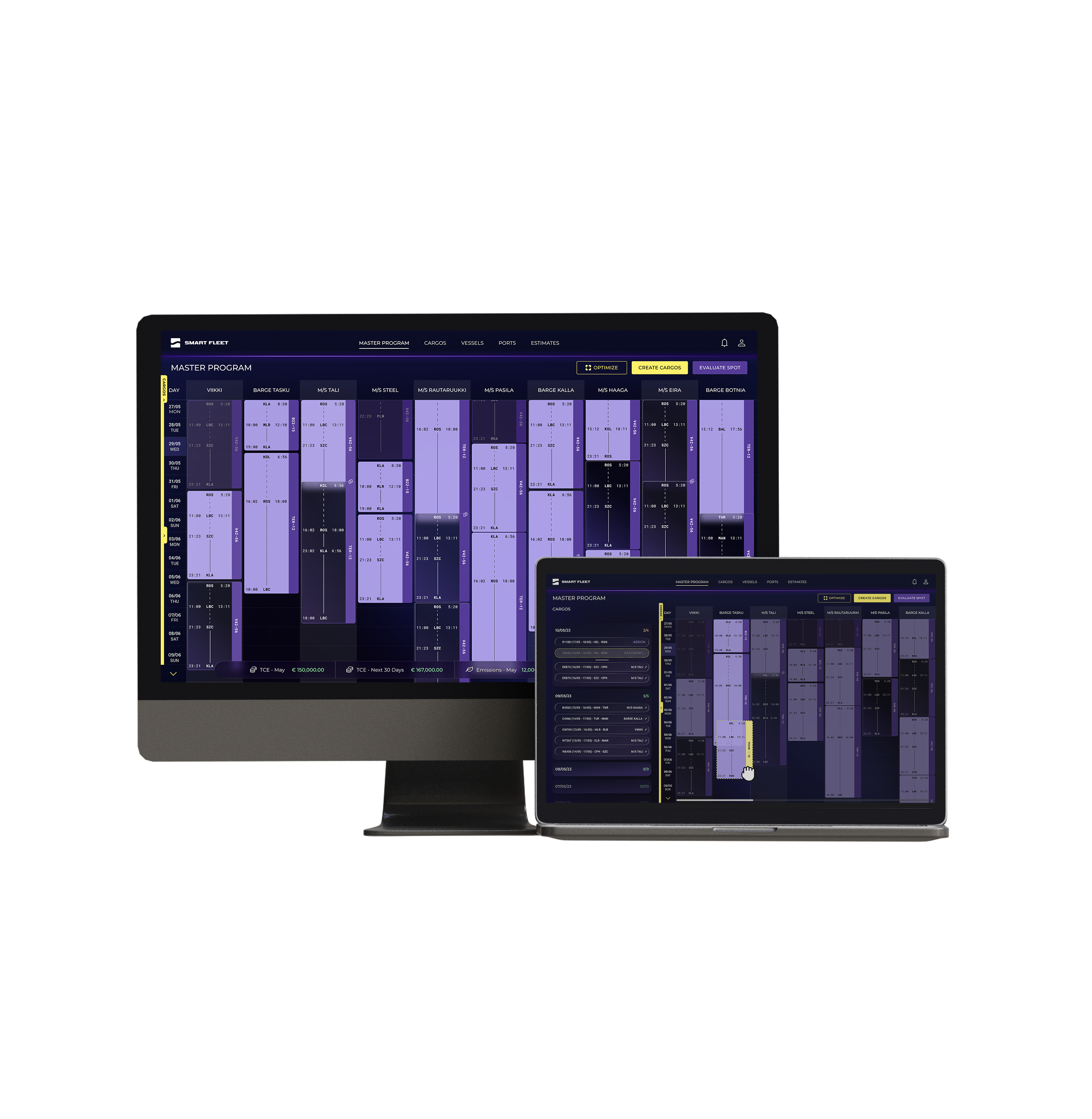
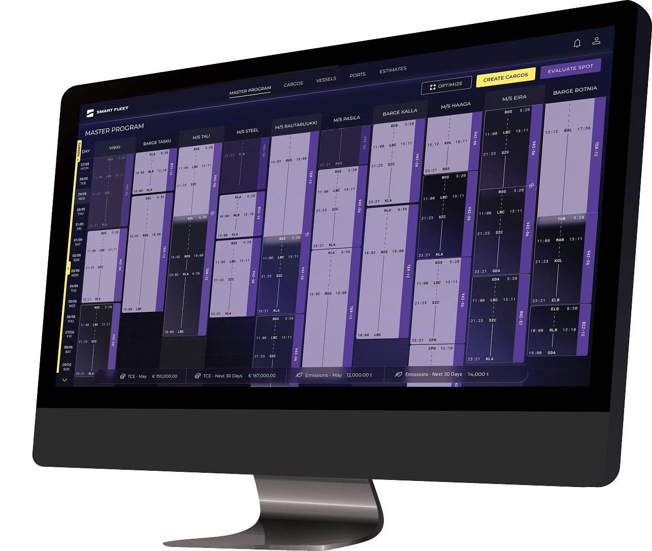
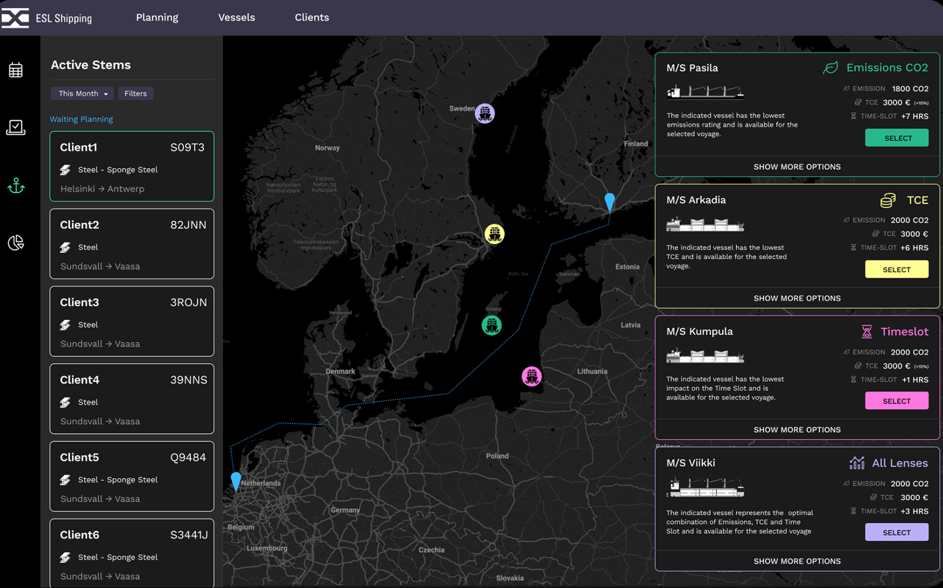
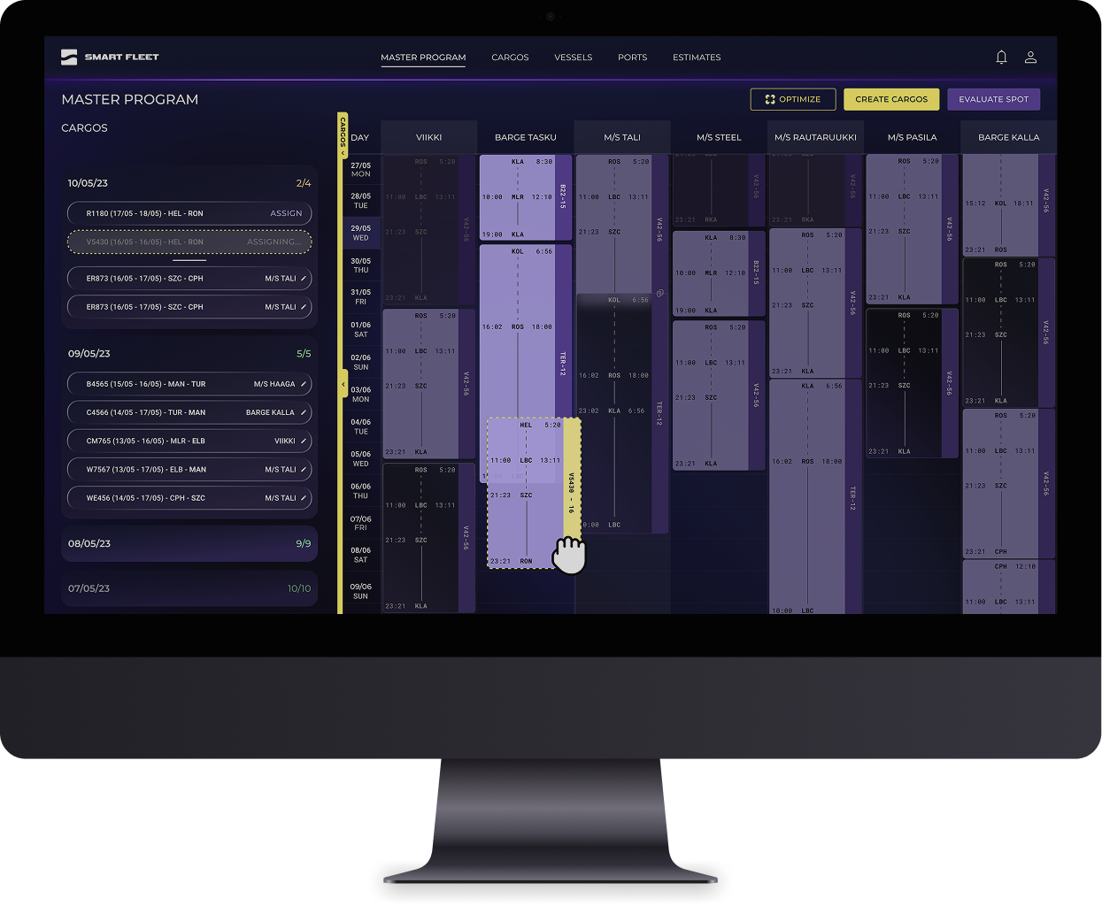
The goal: help maritime operators maximise voyage profitability while meeting increasingly demanding environmental and regulatory requirements. The system needed to evaluate thousands of combinations of cargo, timing, and routing — and surface the best option, fast.
The Core Challenge
"Maritime jargon is complex. We created a shared glossary to ensure designers, devs, and stakeholders were aligned on technical terminology from day one."
Ports, offices,
and real challenges.
A pioneering AI solution for maritime planning, where design was strictly shaped by rigid operational workflows.
Redesigning legacy workflows shaped by Veson required UX-driven solutions to overcome poor documentation and system constraints.
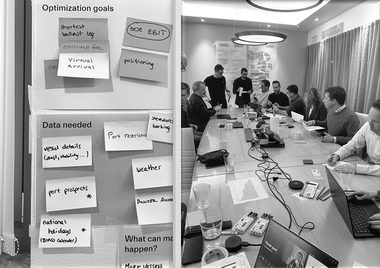
The project required close collaboration with stakeholders and teams from Finland and Sweden. Aligning business goals and technical constraints across different teams, added an additional layer of complexity to the design process.
01 — On-site
Port & Office Visits
Finland · Sweden
02 — Workshops
Discovery & Empathy
Map Flows facilitation
03 — Research
Employee Interviews
Real pain-point mapping
04 — Define
Shared Glossary
Cross-team alignment
Research Insight
"Different teams, different needs — aligning business goals and technical constraints across Finland and Sweden added a critical layer of complexity to the design process."
Translating complexity
into clarity.
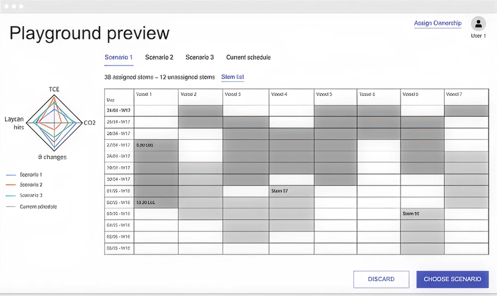
This phase was about translating research into logic. Working closely with Service and Business designers, we faced a major hurdle: incomplete discovery documentation. This led to misunderstandings and friction — teaching us that always closing the discovery phase is just as vital as the research itself.
We implemented cyclical research-sync sessions to ensure the entire team stayed aligned and had a shared "source of truth" throughout the design process. Wireframes were validated on-site in Helsinki — presenting directly to stakeholders and refining in real time.
01 — Sketch to Flow
Initial Wireframes
End-to-end user flows
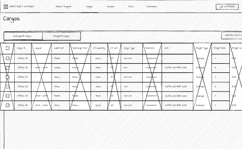
02 — Complex Data
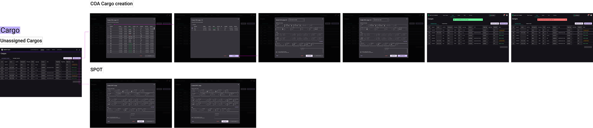
Cargo Cards Design
Heavy-duty data tables
03 — On-site
Helsinki Validation
Live stakeholder refinement
04 — Sync
Research Sync Sessions
Cyclical team alignment
Key Takeaway
"Closing the discovery phase properly is just as critical as running it. A shared source of truth prevents misalignment at every stage downstream."
MUI as a foundation.
Custom where it counted.
To handle the project's scale, we built our application using MUI (Material UI) as the foundation. This brought a significant challenge: a major Material Design update landed mid-project, forcing us to strategically cut our dependency and implement a stable, consistent source of truth for the development team.
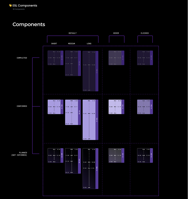
We designed a custom library — creating components like the Voyage Cards that were missing from standard MUI kits. Design Tokens were introduced as the primary bridge between engineering, ensuring all design specs were compatible with MUI and minimising friction during handovers.
Typography: Roboto Mono — chosen for its perfect vertical alignment of dynamic numerical data, precise real-time monitoring, and distinct glyphs that enhance operational safety. The color palette is fully WCAG compliant, balanced to meet accessibility standards while avoiding harshness of extreme contrasts.
Systems Decision
"We introduced Design Tokens as the primary bridge to engineering — ensuring all design remained compatible with MUI and minimising friction during handovers."
From validated wireframes
to production-ready flows.
The final phase focused on transforming validated concepts into high-fidelity mockups and flows that bridge the gap between complex data and intuitive action. Using the established Design System, detailed interface specifications ensured a seamless hand-off and implementation.
Our work coincided with a major Material Design update — leaving us caught between legacy components and new standards. To avoid a "revolving headache", we made the strategic call to rely strictly on MUI's implementation, ensuring a stable and consistent source of truth for the development team.
Outcome
"A production-ready system where AI evaluates thousands of cargo and routing scenarios in real-time — balancing profitability, emissions, and time for every voyage."